Let Your Brain Do the Work: The Science Behind Recallify's New Category Colour Indicators
How evidence-based colour coding reduces cognitive load and helps neurodivergent users process information faster
Colour coding in memory apps is a small design decision that can dramatically reduce cognitive load. In Recallify, category colour indicators help people quickly distinguish between tasks, learning, and reminders, supporting users with ADHD, dyslexia, and memory difficulties.
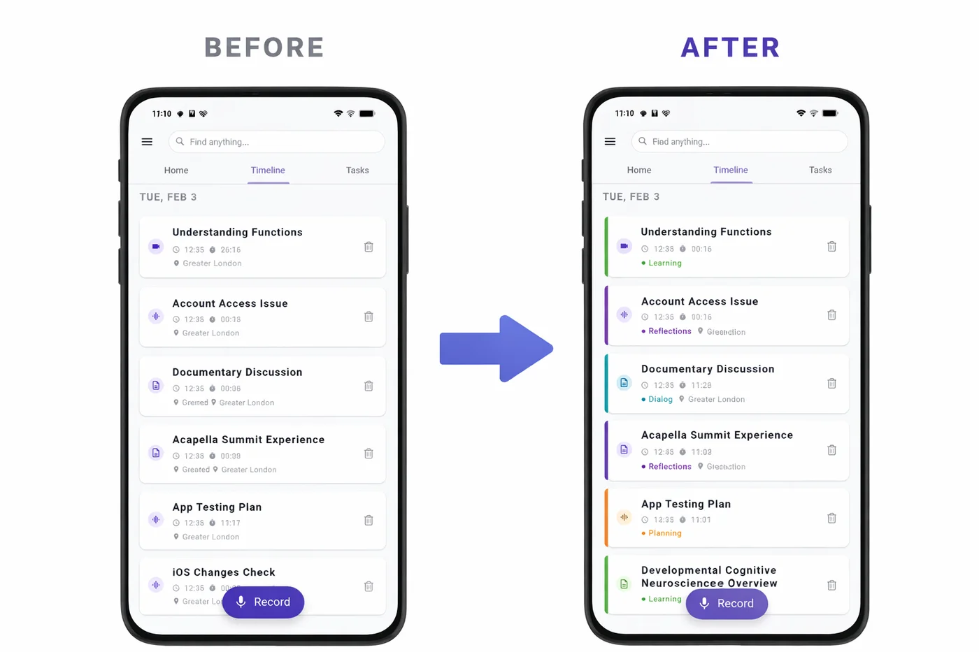
We're excited to announce a new feature in Recallify that might seem small at first glance, but is backed by significant neuroscience research: Category Colour Indicators. Each recording in your Timeline now displays a coloured left border that instantly communicates its category — Tasks, Reminders, Learning, Clinical, and more — without you having to read a single word.
For users with ADHD, acquired brain injury, or anyone who struggles with information overload, this isn't just a visual enhancement. It's a cognitive support tool designed to let your brain's natural pattern recognition do the heavy lifting.
The Research: Why Colour Coding in Memory Apps Works
Colour cueing isn't just aesthetically pleasing — it's scientifically proven to reduce cognitive load and improve information processing. A meta-analysis of colour effects on learning found that strategic use of colour in educational materials produces a retention effect size of g+=0.53, representing a meaningful improvement in how well people remember and categorise information. This is precisely why colour coding in memory apps can make such a practical difference.
But not all colours are created equal — and choosing the right colours for specific categories requires careful consideration of both psychological associations and accessibility requirements.
Red for Action: The Science of Urgency
When deciding which colours to assign to our ten content categories, we started with the most critical: Tasks. Research from the University of British Columbia found that red improves performance on detail-oriented tasks by 31% compared to blue. This makes red the ideal choice for action items that require attention and completion.
Red is universally associated with urgency, importance, and "stop and pay attention." In project management conventions, red consistently indicates high-priority or urgent items. For users with ADHD who struggle with task prioritisation, this instant visual signal helps cut through the noise.
We paired Tasks (red) with Reminders (deep orange) to create a warm colour family for action-oriented content. Both categories represent things you need to do or remember — grouping them visually helps your brain recognise "this needs my attention" without conscious processing.
Calm Colours for Sensitive Content
For Clinical content — medical appointments, therapy notes, health information — we deliberately avoided red despite its traditional association with healthcare (think Red Cross). Research in healthcare UX design shows that red can trigger anxiety in health contexts, with negative connotations of danger and emergency.
Instead, we chose teal — the colour of medical scrubs — which carries calming associations while remaining distinctly "medical." This is particularly important for users managing chronic conditions or those with brain injury who may already experience heightened stress around health matters.
Recallify Category Colour Palette
Accessibility First: Designing for Everyone
Visual features are only useful if everyone can perceive them. We designed our colour system with WCAG (Web Content Accessibility Guidelines) principles in mind:
Colour is never the only indicator. Each category also has a distinct icon visible in the detail view, and category names are always displayed as text. The colour indicators supplement — rather than replace — other identification methods.
High contrast values. All category colours use shade700 variants from the Material Design palette, ensuring sufficient contrast against white card backgrounds. This benefits users with low vision and those viewing screens in bright lighting conditions.
Colourblind-friendly distinctions. We avoided problematic combinations like red-green adjacency for semantically related categories. Our action-oriented categories (Tasks, Reminders, Planning) progress through red-orange-amber, which remains distinguishable for most types of colour vision deficiency.
User control. The feature can be toggled off entirely in Settings for users who find visual complexity overwhelming or prefer a cleaner interface. We also provide a "View Colour Legend" option so users can reference what each colour means at any time.
Why Colour Coding in Memory Apps Matters for Neurodivergent Users
For people with ADHD, visual scanning and rapid categorisation are often challenging. The constant question of "what type of thing is this?" creates micro-decisions that drain cognitive resources. Colour coding eliminates these micro-decisions by making category information pre-attentive — your brain processes it before you consciously look at it.
For users with acquired brain injury, cognitive fatigue is a daily reality. Every bit of mental effort saved on organisational tasks is effort that can be redirected to what matters. As one of our case study participants noted, tools that reduce cognitive load aren't luxuries — they're essential for maintaining independence.
This aligns with Recallify's core mission: using AI and thoughtful design to handle the cognitive heavy lifting so you can focus on living your life.
The Complete Colour System
Here's our evidence-based category colour mapping:
| Category | Colour | Why |
|---|---|---|
| Tasks | Red | Urgency, action required, proven effectiveness |
| Reminders | Deep Orange | Time-sensitive, grouped with Tasks |
| Planning | Amber | Future-oriented thinking, warm but distinct |
| Meetings | Blue | Professional, calming, conventional |
| Dialog | Cyan | Communication, conversation |
| Reflections | Purple | Introspection, personal thought |
| Learning | Green | Growth, knowledge acquisition |
| Clinical | Teal | Calm medical association |
| Instructions | Indigo | Structured, procedural |
| Other | Grey | Neutral fallback |
Try It Today
Category Colour Indicators are enabled by default in the latest version of Recallify. Open your Timeline and you'll immediately see the difference — each recording now wears its category on its sleeve (or rather, its left edge).
Want to adjust the feature? Head to Settings > Show Category Colours to toggle it on or off, or tap View Colour Legend to see the full colour mapping.
We'd love to hear how this feature works for you. Does colour coding in memory apps help you scan your Timeline faster? Are there categories you'd like to see coloured differently? Let us know — your feedback shapes how Recallify evolves.
Ready to experience smarter memory support? Download Recallify and let colour do the cognitive work for you.
Related reading:
iOS App
Download Recallify from App Store for smart task management support today.

Android App
Get Recallify from Google Play for smart task management support today.